smile partners
context
Nonprofit Website Redesign
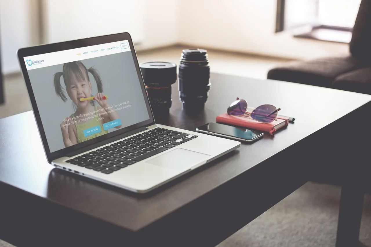
Smile Partners is a non-profit mobile dentistry clinic, servicing low income children and seniors in the Puget Sound area. The representative for this project wanted suggestions on how to improve the site layout for easier access to information and maximized donations.
Beyond the requested deliverables, I suggested we redesign the entire website on a new platform that would be easy for the Smile Partners' team to manage and update. The project was successful and the new website was launched via Squarespace.
overview
Goal
Redesign Smile Partner’s website for easier mobility and to reflect both the goals of the business and the needs of the targeted personas. Deliver to the client a fully redesigned website, along with deliverables as agreed upon in the brief by my team and the client.
My Role
Project Manager
Information Architect
Tools
Sketch
inVision
OmniGraffle
Smile Partners’ existing website
Squarespace
time frame
Two weeks
my Deliverables
Project Brief
Website Content Audit
New Website Sitemap
Web Hosting Website Comparative Competitive Analysis
Sprint Schedule
Project Scope
Team Deliverables
A New Smile Partners Website
Website Style Guide
Wireframes
Competitor Website Analysis
Research Analytics
Personas
Stakeholder and User Interviews
Challenge
Problem Statement
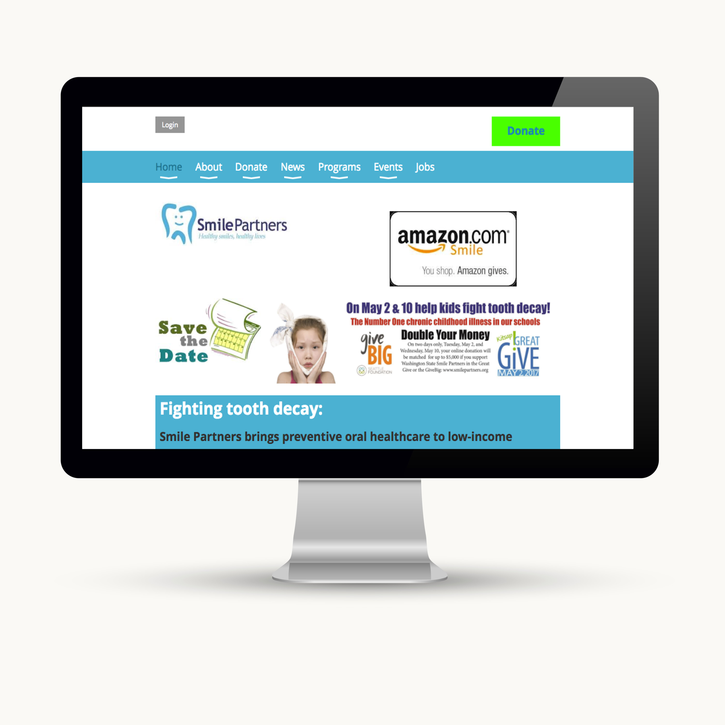
The Smiles Partners current website lacks a professional aesthetic, has a confusing donation process, and does not offer easy access to the products the user needs.
Solution Statement
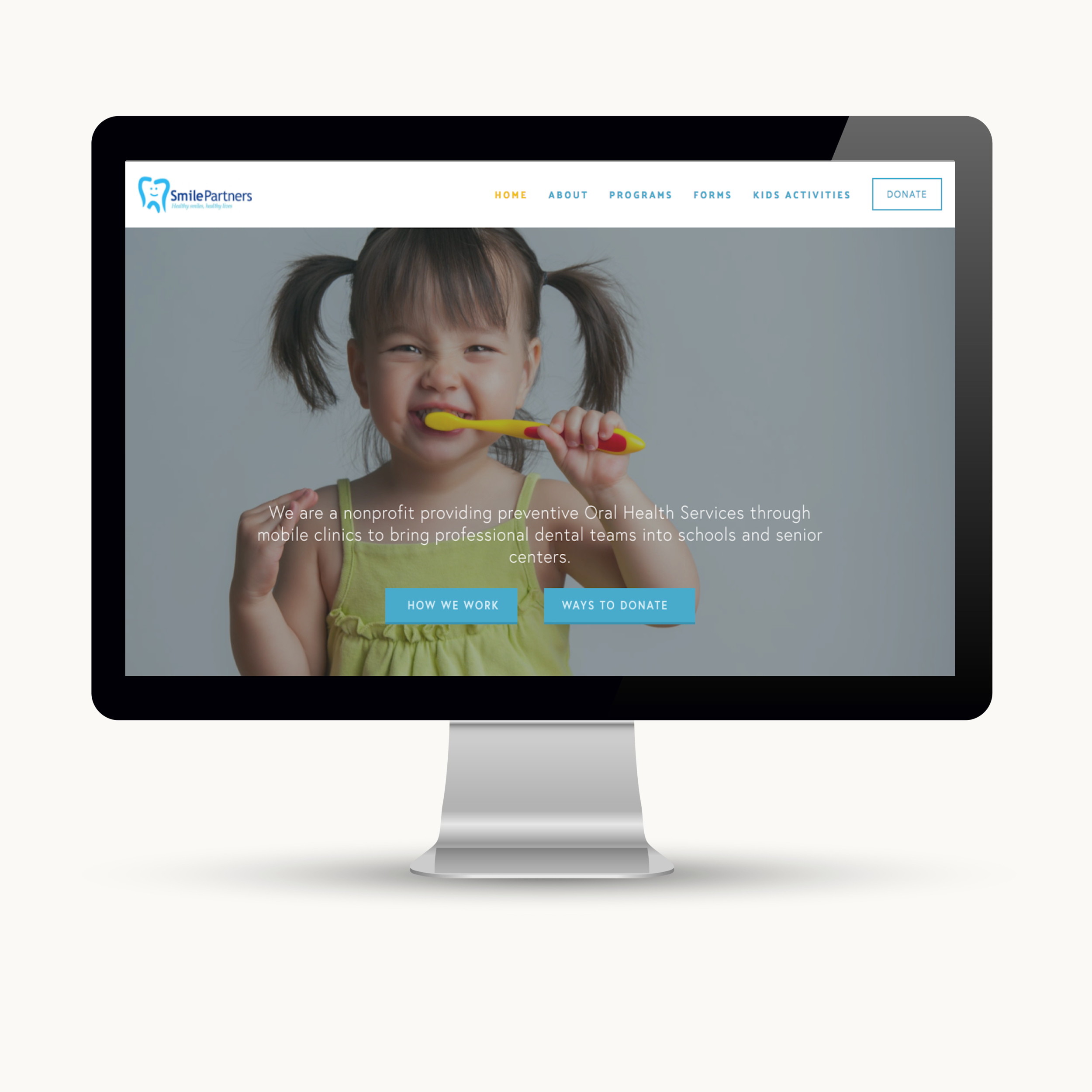
By redesigning the Smile Partner’s website with improved navigation, functionality, and a clean aesthetically appealing interface; the new website will meet both business goals, and user needs.
Before Redesign
After Redesign
Process
deep dive
Research
Extensive research was conducted to better understand how the Smile Partners’ website would best reflect the needs of the sites primary users. Questionaries utilizing usability specific heuristics were sent out to stakeholders and users to assess functionality. The results were then affinity mapped to reveal a hierarchy of goals and preferences which informed my design decisions.
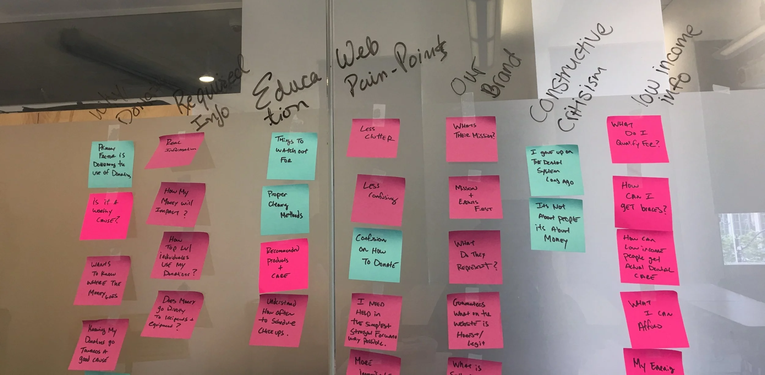
To determine how we needed to transform the website, we broke down our business goals and user goals as follows:
Business Goals:
Clean and simplistic layout
Simple donation process
Easily accessible information
Features that attract users to the site
User Goals:
Easily accessible information
Clear contact info
Easy navigation
Downlaodable Forms
Information Architecture
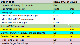
In order to optimize the new site, I needed to know all that was contained in the current website. I conducted a site audit and organized all of the site's pages into an Excel spreadsheet.
Website Content Audit
Site Index
This categorizing allowed me to understand what content would need to transfer to the new site, and what content would be edited or deleted.
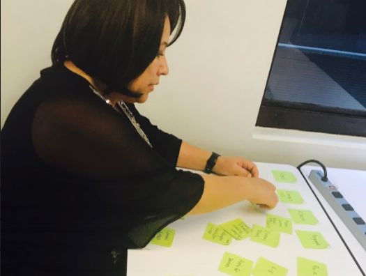
The next step was to arrange the site navigation to best fit our personas’ needs and support our business goals. To achieve this, I recruited several users to card-sort the navigation options into an intuitive order. This allowed us to gain insight into how a user would expect to see the information they needed on the sites homepage.
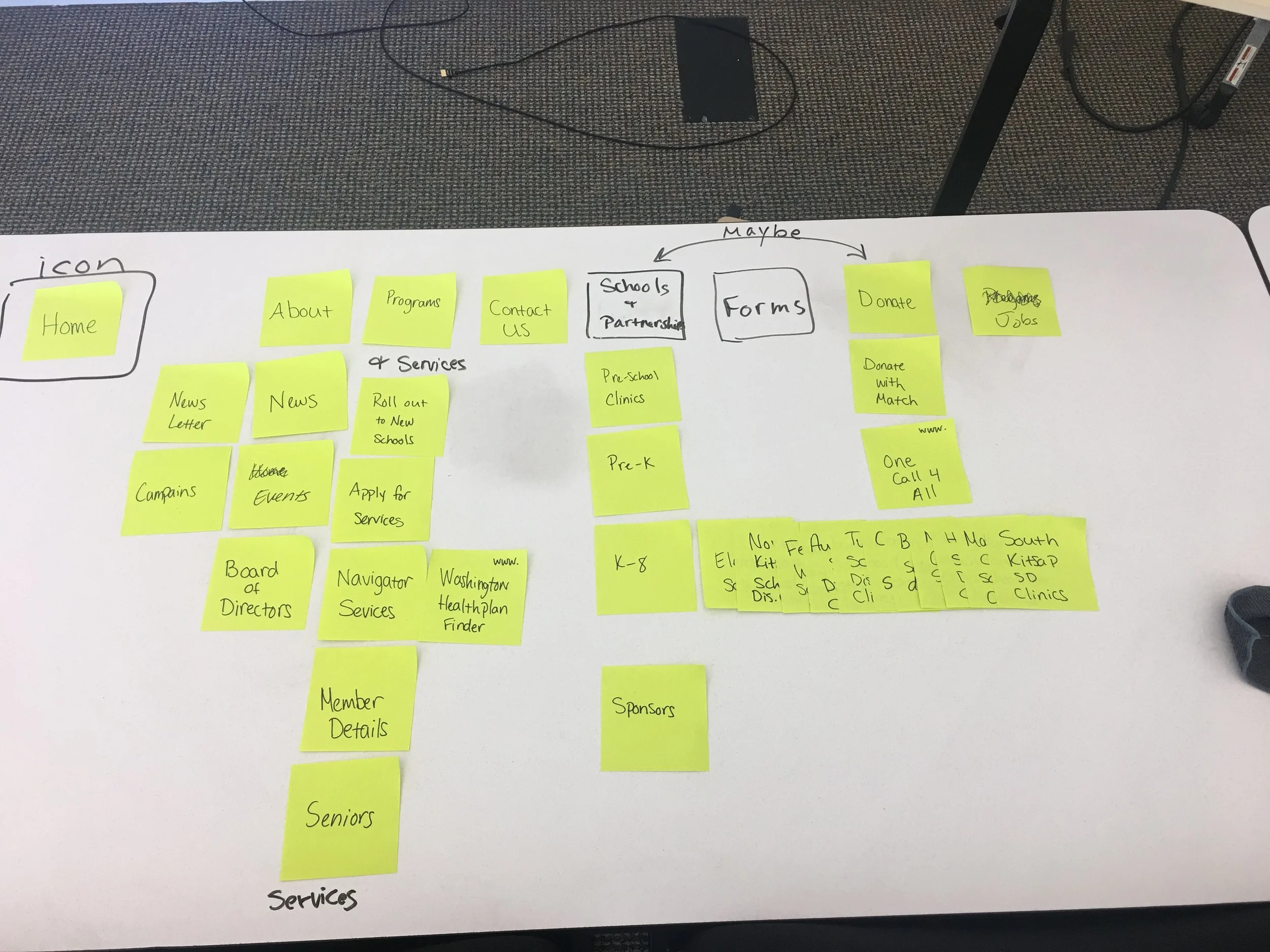
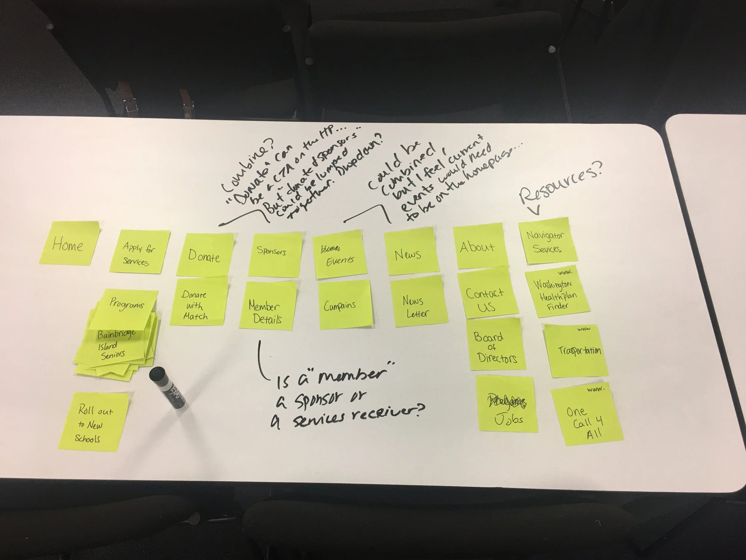
After several iterations, a testable primary navigation emerged. Below are before and after models of the sitemap. The colors here represent the items that were in the website's original navigation in aqua. Some items were renamed or rearranged to reflect user feedback.
Old Sitemap New Sitemap
Some features were moved from the original navigation into the footer like “news” (as seen in purple) which was also renamed to “blog” as it was more of an account of the organizations previous work and events.
New features were also added, like “forms” and “kids activities” as seen in yellow. The Donate buttons, represented in green were reduced to one main navigation button.
Design
Our team used the Design Studio method to rapidly sketch ideas for the home page and donation page views. Below is a conglomerate of several sketch party outcomes.
A style guide was developed in keeping with the NGO's brand, current logo, and the style requests by the client representative, Jackie. The next step was to develop personas and applicable user scenarios to test out the prototype.
The Smile Partners website has two primary users; the parent and the donor. Wireframes were made to test the persona scenario user flows. These wireframes were later translated to a Squarespace template after final iterations were made, based on user feedback.
Testing
The following task scenarios were created for testing:
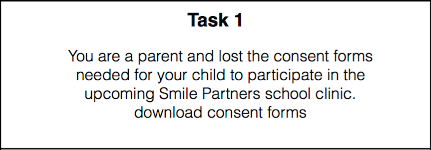
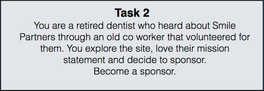
The user flows were tested using the low-fi wireframes in inVision, to ensure the flows were strait forward and the website easy to navigate.
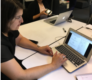
The two scenarios that were most representative of our business needs and primary users’ goals were tested by participants.
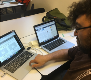
Changes to the site were made based on user feedback; including additional donation links and a more prominent mission statement.
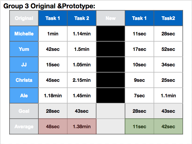
Based on the information architecture I organized and the new navigation implemented, the new site navigation had significantly improved task completion times.
iterations
I suggested increasing the overall font size across the website template to a size 16 to improve readability and accessibility for Smile Partner's elderly demographic.
project Management
client meeting
I introduced our client to Slack, and created a channel for all of our communications. We had video meetings via Appear-in with our client 3-4 times per week during the two week process, with exception to the last two days.
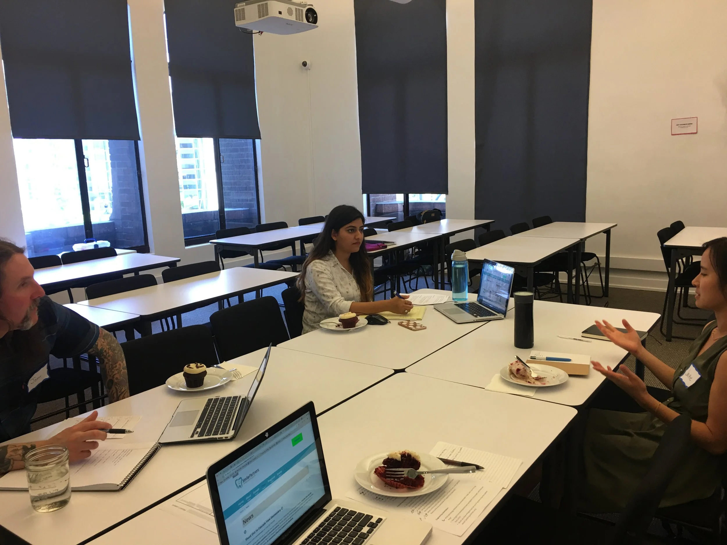
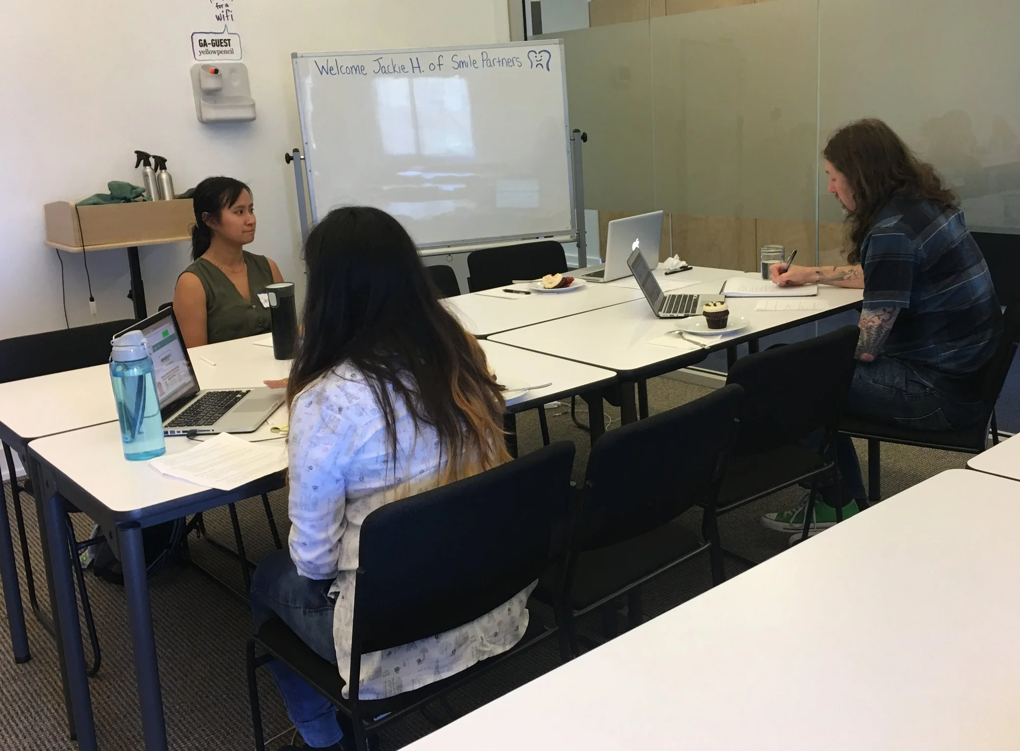
The result was a website that met the intended business goals and users' needs, that brought the client to tears.
organization
Using Trello allowed me to assign our daily tasks a value, and Google calendar to organized weekly activity. This helped the client understand the time and value of each of the deliverables.
We had daily meetings as a team to discuss where we were on a given task, if adjustments to the schedule needed made, and what we would be working on for the day. Our frequent meetings with our client also made it easy to get answers to questions, helping us avoid (or quickly move through) blocks, during the process.
Team Dynamic
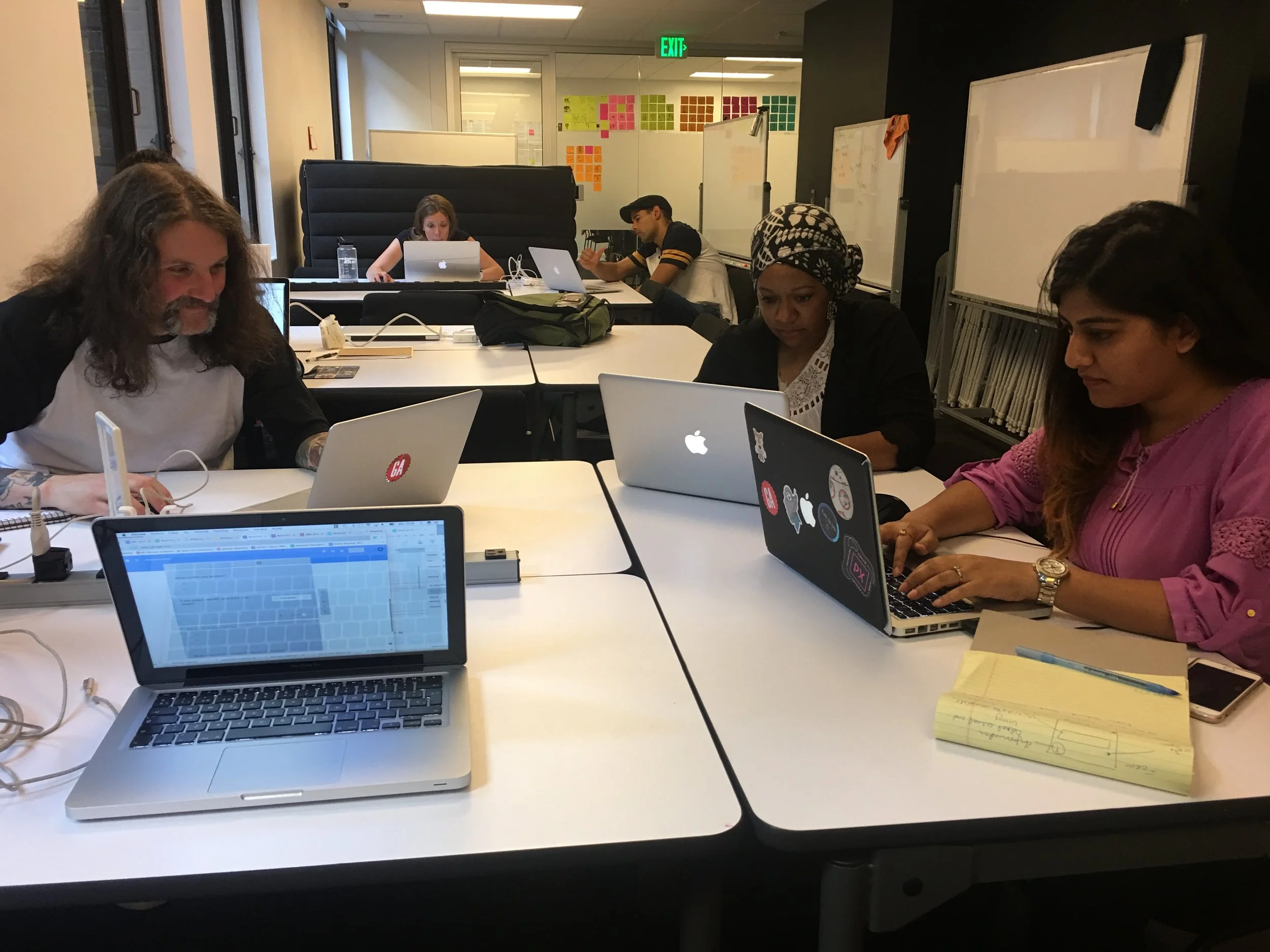
I referenced the Myer-sBrigs 16 personalities index to better understand my teammates' communication styles. This information allowed me to adjust my approach to each of my team members.
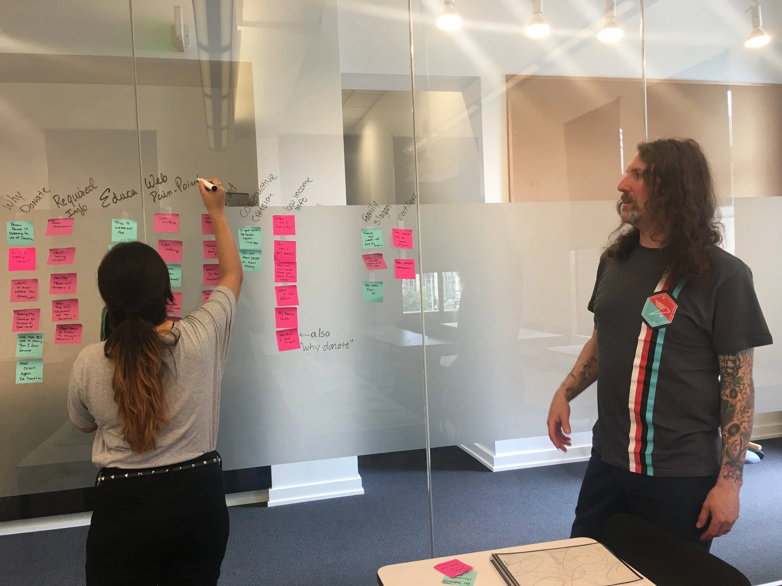
We agreed to addressed any concerns immediately and directly, in an open and free manner. This also made it easy to move efficiently through our decisions, and enabled our team to operate more cohesively.
next steps
recommendations
Include interactive games in the kids corner.
Create an employees page.
Utilize Squarespace's analytics to track improved site traffic and donations
Hindsights
Glow
I loved the look on the client’s face when we delivered our final product to her. She said it made her tear-up a little when she saw it. That feeling is priceless.
Grow
Auditing the website and organizing all it’s content was extremely helpful, but took many tedious hours. I could have scheduled more time for this process.
lessons
1. Working with nonprofits is great!
There are amazing people on this planet, doing truly wonderful things. Learning all that Smile Partners does for the communities it serves was inspiring.
2. Taking time to understand others communication styles saves valuable time in the long run.
When I took the time to inquire about a potential communication breakdown in my group, it helped me better understand my group member’s communication style and what adjustments I needed to make to better lead the team and progress through the project.
3. Learning takes time.
This project really solidified the UX process for me. I came away with a very clear understanding of how each step in the system works to produce the intended results. There's still so much to learn, but I feel confident in my process.
~end~
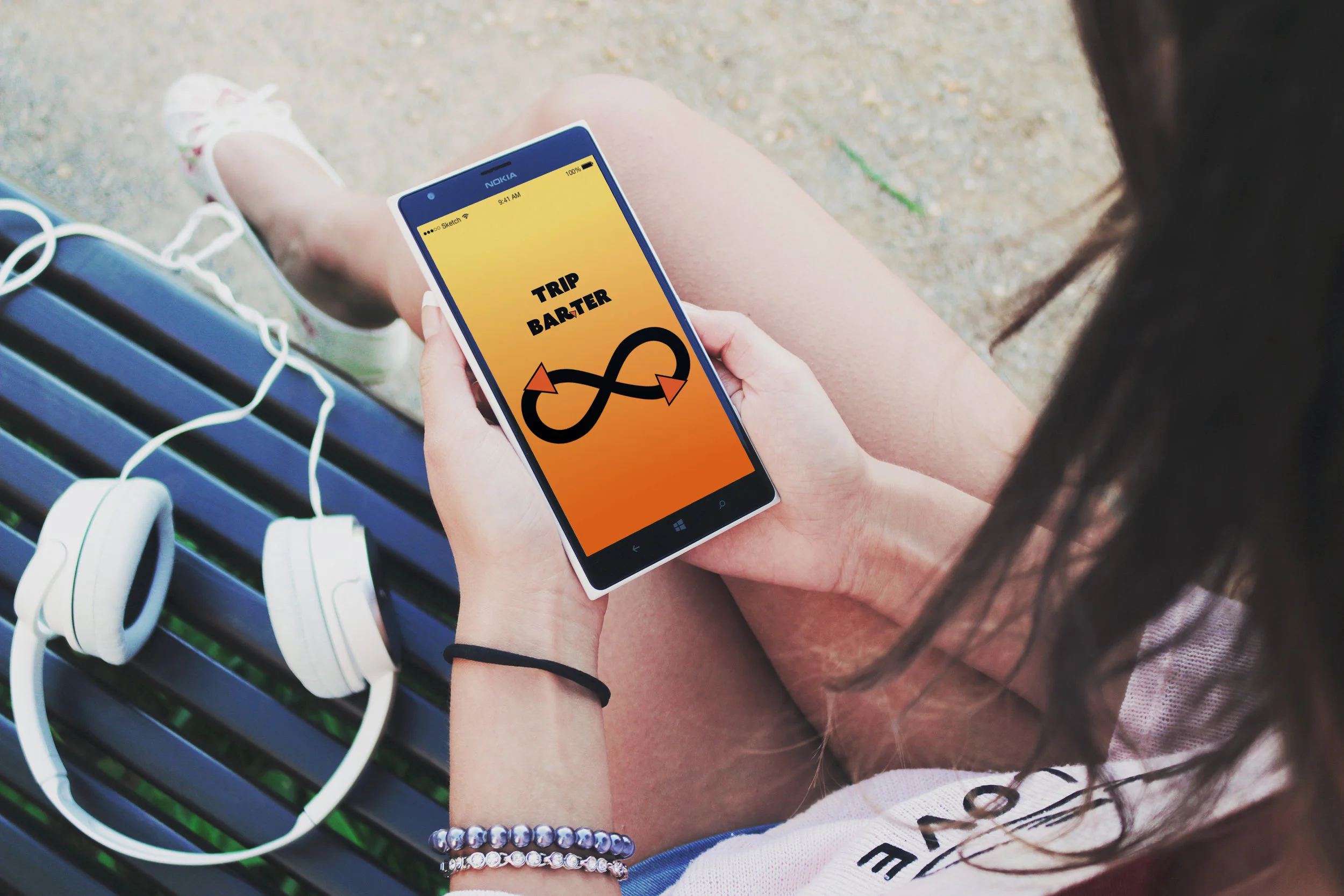
Trip Barter
Carpool Meets Bartering App
A Case Study
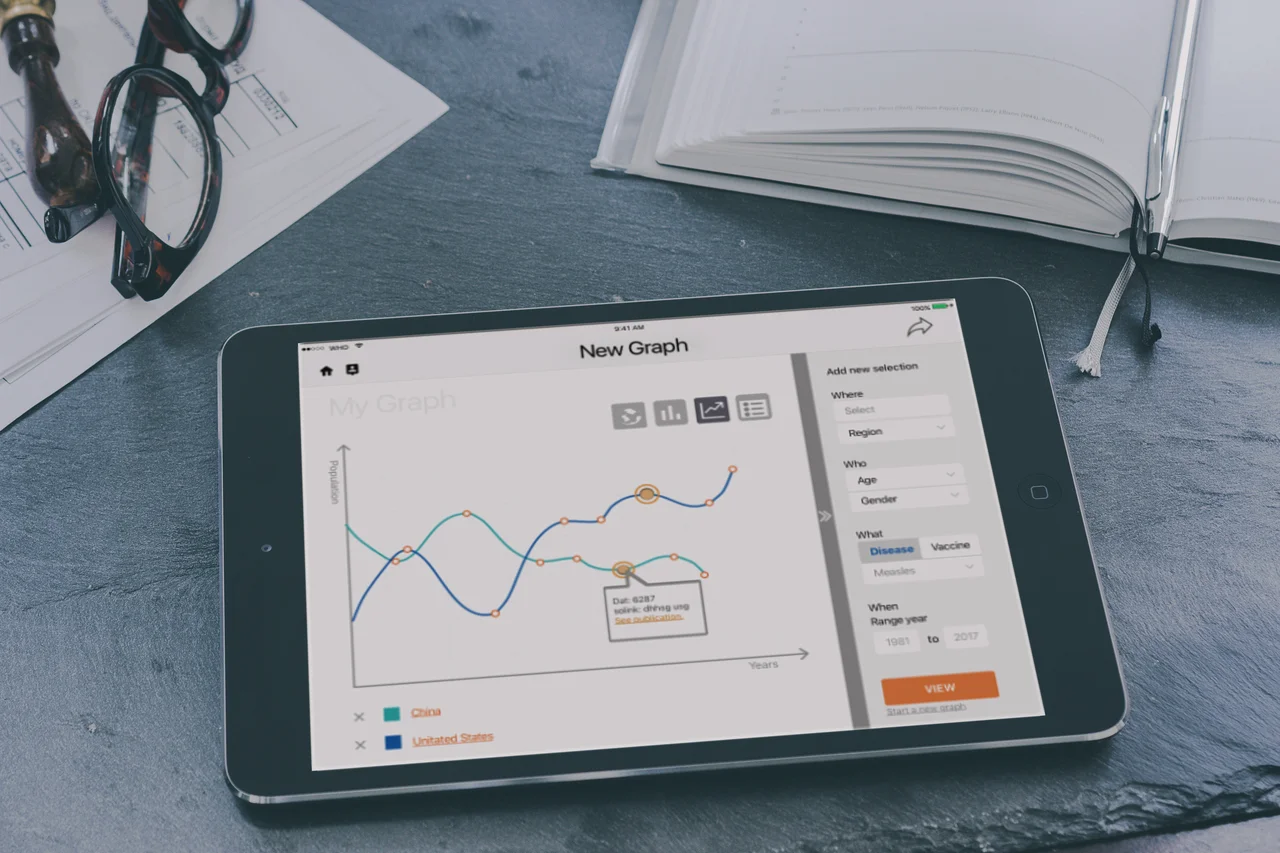
Immunization Summary
Data Visualization Optimized for Tablet
A case study